Hi, I'm Mackenzie!
I'm so happy you're here :)
Branding

Free Spirit Spheres

Påleg

Bits and Bolts

Frön

Coho Construction
Science Communication

Salmon Infographic
:

Informational Videos
Editorial Design

Gökotta

Functionalism: Type Principles

Know Your Worth
Other Work


Want to know more?
Get to know me and the passion behind my design work by clicking the button below.

A little about me
I am a recent graduate from Vancouver Island University (VIU) with a Bachelor’s degree in Graphic Design. I have a background in Fisheries and Aquaculture and a love for science. My curiosity, drive, and attention to detail, which made me a strong science student, now help guide my design process! I am passionate about creative problem-solving and pushing myself to try new approaches and methods.I was born and raised on the beautiful, lush, and always-green, Vancouver Island. I've spent a lot of time exploring it and try to capture the same organic, fun, and refreshing feeling that it gives me through my design work. I would call my style bubbly and uncomplicated, but I love to challenge myself to break away from that when the project calls for it.

Here's a few of my favourite moments on (and around) Vancouver Island


My Program Toolbox


Got questions? I've got answers. Let's chat!
Free Spirit Spheres
A rebrand for a luxury treehouse company

This project focused on a theoretical rebrand for Free Spirit Spheres, a luxury eco-hospitality experience located in Qualicum Beach on Vancouver Island. Known for its one-of-a-kind accommodations, Free Spirit Spheres offers guests the opportunity to stay in one of three handcrafted spherical treehouses, each uniquely designed both inside and out. It is an immersive getaway perfect for couples, creatives, and those seeking a meaningful escape into nature. The rebrand involved developing a cohesive visual identity, including a refined logo system, adaptable variations, and clear brand guidelines for typography and colour.
Winter 2025
Programs Used:

Illustrator

Photoshop


The Challenge
One of the primary challenges of this project was working with an existing brand that lacked a strong visual foundation. The original logo was hard to read and was not effective across different formats. Additionally, there were no logo variations, which restricted its adaptability in various contexts.Free Spirit Spheres also did not have a defined colour palette or typography system. This also complicated the process, as there was no cohesive framework to build from. This meant the rebrand required not only a redesign of visual elements but also the creation of a brand ecosystem that could support consistency, clarity, and scalability in the long run.
Original Logo


The Approach
To address these challenges, I first started by diving into the history, values, and energy of the company. This included researching different visual directions that could represent Free Spirit Spheres and what they represent. Understanding the owners, their passions, motivations, and vision, played a key role in shaping the direction of the brand identity.After that, the focus shifted to defining the tone of the brand and determining how it should be expressed visually. This process involved experimenting with forms, styles, and references to find a balance between authenticity and clarity. Drawing inspiration from other “forest-inspired” companies helped inform the creative direction while ensuring the final outcome remained distinctive and meaningful.
Making It Happen
In executing the rebrand, I utilized industry-standard design tools to bring the new identity to life. Using Adobe Illustrator, I designed the primary logo along with a set of adaptable variations to ensure flexibility across different applications. Illustrator was also used to establish the brand’s typography and colour palette, forming a cohesive set of guidelines that support consistency in future use.To demonstrate how the branding functions in real-world scenarios, I created product mockups in Adobe Photoshop. These mockups helped visualize the brand in action, showcasing how the identity translates across physical and digital media while reinforcing its overall effectiveness and appeal.


Påleg
Artisanal Balsamic Glazes

Påleg is a branded series of artisanal balsamic glazes I designed. The name comes from the Norwegian word "pålegg" which describes the toppings and spreads that go on to open sandwiches, such as a balsamic glaze. The designs are inspired by the individual flavours. Påleg bridges the traditional balsamic glaze taste, with a modern look and feel. The bottles are made to look cute on the shelves in the store AND your shelf at home!
November 2024
Programs Used:

Illustrator

Photoshop

Lightroom


The Challenge
This project involved creating a brand from scratch, including packaging for three different balsamic glaze flavours. One of the main challenges was working within the small size of the bottle, where space for text and visuals is very limited. Each flavour needed its own distinct look while still feeling like part of the same brand.The packaging also had to be both practical and eye-catching, so it could stand out on store shelves while clearly showing important product information. Finding the right balance between clarity, readability, and visual appeal in such a small space required careful planning and thoughtful design decisions throughout the process.


The Approach
The design process began with researching competitor products to understand current trends and find ways to stand out. Many balsamic glaze brands use traditional, rustic styles, so the goal was to take a more modern approach. This involved exploring clean layouts, contemporary typography, and bold visuals to help Påleg feel fresh and distinctive.Another important idea was designing a bottle that people would want to keep even after it was empty, treating it as more than just packaging. This perspective guided choices around colour, pattern, and overall design, helping create a final product that feels both practical and visually appealing.
Making it Happen
To bring the brand to life, I used bright colours and clean sans-serif fonts to create a modern, friendly look. In Adobe Illustrator, I designed bold patterns that help each bottle stand out while still feeling part of the same brand. These patterns also make it easy to tell the different flavours apart.After finalizing the designs, I printed the labels and carefully applied them to the bottles with attention to detail. I then photographed the finished products and edited the images in Adobe Lightroom, creating clean, professional visuals that show how the branding looks in a real-world setting.


Bits and Bolts
Women-owned and operated hardware store

For this project, I created a hypothetical hardware store named Bits & Bolts. It is woman-owned and operated and their slogan is "For bite-sized projects". Their mission is to make the DIY world more accessible and less intimidating for everybody.
Winter 2024
Programs Used:

Illustrator

InDesign

Photoshop


The Challenge
This project focused on developing a logo for a fictional hardware store. I began by selecting a name that felt distinctive, while still clearly communicating the nature of the business. Once I landed on Bits & Bolts, I moved into the logo ideation phase.The primary challenge was finding a way to stand apart from the bold, blocky, angular typography commonly used by hardware stores, while still preserving a recognizable industry aesthetic. It was important that the final logo felt approachable and easy to read, without losing its connection to the hardware identity and DIY community.


The Approach
I began by researching competitor hardware stores to better understand how to fit within the industry while still standing out. My goal for the logo was to create a more organic feel, something slightly imperfect and handmade, echoing the spirit of a do-it-yourself project.I also made a conscious decision to avoid using yellow or red, as these colours are commonly associated with power tool brands and hardware stores. Instead, I chose a welcoming, calming blue as the primary colour to help set Bits & Bolts apart while maintaining a sense of approachability.
Making it Happen
With the organic, friendly logo established, I began applying the brand across a range of practical touchpoints. One of these was a rack card, which needed to communicate essential information without overwhelming its limited space. Using Adobe InDesign, I brought together the logo, brand assets, and imagery to create a piece that feels clear, engaging, and easy for consumers to pick up.I also developed a magazine and billboard advertisement using Adobe Photoshop and InDesign, designed to capture attention and reinforce the brand’s visual identity. Finally, I used InDesign and Illustrator to produce a series of branded stationery and vehicle wraps, ensuring consistency across all materials.


My mom and dad sitting on the pergola that she built in her garden!
A little background
My inspiration for this project was my mom. She has always been big into DIY projects and loves any opportunity to build something with her hands. From personal experience, hardware stores aren't always the most welcoming places, especially for women. They can be overwhelming, and sometimes asking for help leads to a belittling feeling by staff who doubt your capabilities. Bits & Bolts changes that dynamic, by creating a safe environment for both new and experienced builders.DIY projects are supposed to be fun and accessible, and the staff at Bits & Bolts are ready to help. I wanted to reflect this in the logo by using a calming blue colour, fun, rounded typography, and organic shapes, since projects don't always turn out perfect (and thats okay!).
Frön
A kindness project

frön /frø:n/ [n] Seeds; the small, typically hard parts of a plant from which new plants can grow.
pronunciation: frurn (with a rounded vowel, similar to the “i” in bird, but with rounded lips)
As the Designer and Project Manager, I led the creation of this project focused on a social issue I personally care about. I started by choosing a topic and researching it to better understand the problem. From there, I brainstormed ideas, created a research plan, and developed a pitch to explain why the solution is valuable and worth supporting. The project followed a full design process, including concept development, prototyping, testing, and final presentation. It also allowed me to concentrate my existing design skills to a self-directed, research-based project.
Spring 2026
Programs Used:

Illustrator
InDesign

Photoshop


Research and Analysis
I used both primary and secondary research methods to guide the project. I created an anonymous survey to learn about people’s experiences with random acts of kindness and their interactions with strangers. I also reviewed and analyzed several research articles. The results showed there is an opportunity to encourage more kindness beyond close social groups. I tested an early version of the product and used feedback to improve the overall user experience.


Design Process
During the design process, I explored three different ideas through sketching and evaluation before choosing one direction to move forward with. I created a pitch presentation that explained the audience, research, key findings, proposed solution, and final design. I also developed branding for the project, high-quality mockups, and a website to share information and encourage people to get involved.


Design Solution & Deliverables
The final solution focused on “kindness cards,” which are simple tools that encourage people to perform small acts of kindness and build stronger connections within their communities. I designed a system where local businesses could host card dispensers, allowing them to take part in the project. I also created an interactive art installation to spark conversations about kindness, along with branded stickers to help promote the project and reach a wider audience.
Special Circumstances
The project changed over time based on feedback from peers and instructors. While the kindness cards were the original idea, I added stickers and an art installation to give people more ways to engage with the project. One of the main challenges was creating a kindness-focused project that felt meaningful and not too small or unimportant. It was also important to find the right balance between being genuine and avoiding designs that felt overly cheesy.


My parents, sister and me at Neck Point Park, Nanaimo, BC, 2004
A little background
The concept for this project stemmed directly from my parents. Growing up, they taught me the importance of being kind. They often spoke of it as a “seed” to be planted wherever you go. At the time, I followed their advice, but I did not fully appreciate the value in their words until I was much older.To learn more about my long-term goal of spreading kindness and to explore this project in detail, view the full PDF here or by clicking the image below

Can the Salmon be Saved?
The state of salmon in British Columbia
This infographic poster highlights the overall decline of salmon species in British Columbia. It creates a narrative starting with a broad range of the Provincial decline, and narrows to the salmon populations around Nanaimo. I collected the data from Pacific Salmon Explorer, which is an incredible online resource built by the Pacific Salmon Foundation (PSF).
Fall 2024
Programs Used:

Illustrator

InDesign


The Challenge
The primary challenge of this project was to design an infographic that showcased four different types of graphs while remaining clear, cohesive, and visually appealing. It was important to determine which information would be most relevant and impactful for the target audience, which included both commercial and recreational anglers, and those with a general interest in marine ecosystems.Striking a balance between informative content and readability was challenging, as the poster needed to avoid becoming overly text-heavy or overwhelming. Additionally, the design had to be accessible, and understandable to a wide audience. One of the most difficult aspects of infographic design is making complex data clear and digestible at a glance, while still encouraging engagement with the information presented.


The Approach
Given the sensitivity of the topic, the design approach focused on supporting the content rather than overshadowing it. The goal was to create a hierarchy that allowed the information to remain the central focus, avoiding overly decorative elements that might distract from the message. At the same time, it was important that viewers could immediately recognize the subject matter. This was achieved through the use of clear imagery and illustrative cues that quickly communicate the theme of salmon and marine life.The overall approach aimed to balance restraint and engagement, ensuring the design remained respectful, informative, and visually appealing without taking away from the seriousness of the issue.
Making It Happen
To execute the poster, I developed a neutral colour palette to avoid framing the content as overly optimistic or pessimistic, allowing viewers to interpret the information objectively. I created simple silhouette illustrations of the five Pacific salmon species in Adobe Illustrator, helping to immediately communicate the subject and draw viewers into the design. A subtle watercolour background was incorporated to imitate a marine atmosphere without overwhelming the design. I collected and organized relevant data into spreadsheets, then translated it into clear, legible graphs that were refined in Illustrator. Finally, I used Adobe InDesign to structure the layout and typography, selecting a rounded, highly legible body type paired with a traditional serif typeface (inspired by research papers) for headings to reinforce clarity and readability.


Me chilling with the chums at Puntledge River Hatchery in Courtenay.
A Little Background
Growing up on Vancouver Island, I have always been aware of Pacific Salmon and their importance to the economy, livelihood, and recreation of many locals. After my time in the Fisheries and Aquaculture program, I had an even greater appreciation for these fish and their life histories. I then spent over 5 years working with different hatcheries, conservation groups, environmental consultants, and research labs.Working with these fish hands-on and watching them throughout their different life stages, I had grown very fond of salmonids. I have a passion for visual learning, so creating this infographic felt like a perfect way for me to merge my previous career experience, and graphic design experience together!
Science Videos
Informational videos for hatchery workers and researchers
I have worked at the Pacific Biological Station since 2019. Although I spent most of those years working in the Sclerochronology (Fish Aging) Lab, I began working with the Salmon Enhancement Program (SEP) Fish Health & Hatchery Biology (FH&HB) team in 2024 to produce training videos for hatchery technicians. I created 7 videos that have improved educational training opportunities for staff and volunteers at SEP's hatcheries.
Fall 2024–Spring 2026
Programs Used:

Illustrator

Photoshop

Premiere Pro


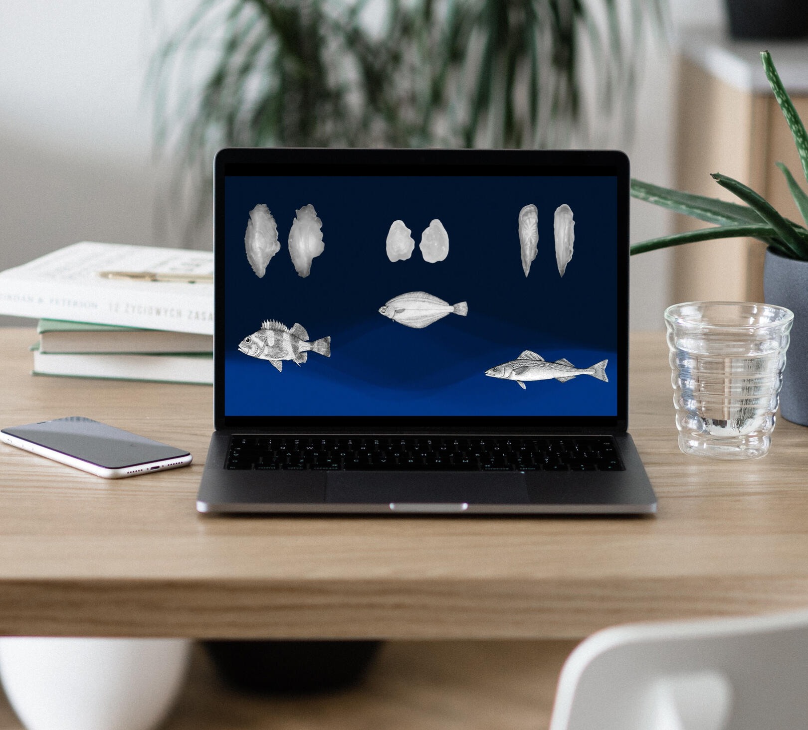
Sclerochronology Lab
While working with the Sclerochronology Lab at the Pacific Biological Station (PBS), I created an informational video discussing how the lab ages fish. This video is used to educate the public and students.


Scale Sampling
After my Sclerochronology video, a few other groups at PBS showed interest in creating instructional videos for their work as well. One of these groups was the Salmon Enhancement Program. The first video they requested was a "how-to sample scales" video to act as an educational tool for new salmon hatchery workers.
BKD Testing
This was the second video I produced for the FH&HB team. It discusses what bacterial kidney disease (BKD) is, how it is transmitted, and the proper techniques when taking kidney samples from salmonids. It uses a combination of illustrations and videos.

Gökotta
Adventure and wellness magazine

Gökotta is a a Swedish concept that involves waking up early to experience the stillness of the morning and appreciate the beauty of nature, particularly birdsong. It is an adventure and wellness magazine full of fun facts, poems, and ways to get more involved with nature.
Spring 2023
Programs Used:

InDesign

Photoshop

Lightroom


Functionalism
A study of principles in typography

This booklet explores typography principles through a Bauhaus lens. It highlights the importance of these principles in graphic design and how they are used. Click here to check out the online version!
Spring 2026
Programs Used:

Illustrator

InDesign

Photoshop


Let's get chatting
Hate website forms? Send me an old-fashioned email at [email protected] or by clicking the mail icon below.
Resume
Professional Profile
Recent Graphic Design graduate passionate about brand identity and fresh, impactful designs
Actively engaged in networking within the Graphic Design industry and supporting local businesses
Four years of experience designing marketing materials
Experienced in creating posters, brochures, and print publications
Proficient in Adobe Creative Suite, including Illustrator, Photoshop, and InDesign
Quick to adapt to new software and design tools
Education
Bachelor of Design in Graphic Design
Vancouver Island University • September 2022 – April 2026
Fisheries and Aquaculture Diploma
Vancouver Island University • Graduated 2019
My Program Toolbox


Work Experience
Art Director
The Navigator • August 2024 – April 2026
Instructional Video Developer
Fisheries and Oceans Canada • January 2025 – March 2026
Graphic Designer
VividSpark Creative • April 2025 – August 2025
Marketing and Promotions Director
Mariners Volleyball Club • October 2021 – Present
Aquatic Science Technician
Fisheries and Oceans Canada • January 2020 – December 2024
[Your Company Name Here]
Let's work together and create something lovely!
Competencies
Technical Skills
4+ years of experience in Adobe Creative Suite Apps
5 years experience using Affinity Software
Photography and photo editing
Communication & Team Skills
Effective team player in both remote and in-person environments
Advocated for enhanced visual learning resources with a colleague
Open to feedback and proactive in skill development
Highly organized, managing multiple projects efficiently
Personable and confident, building strong relationships with teams and clients
.
Got questions? I've got answers. Let's chat!
This page is under construction!
Check back soon :)